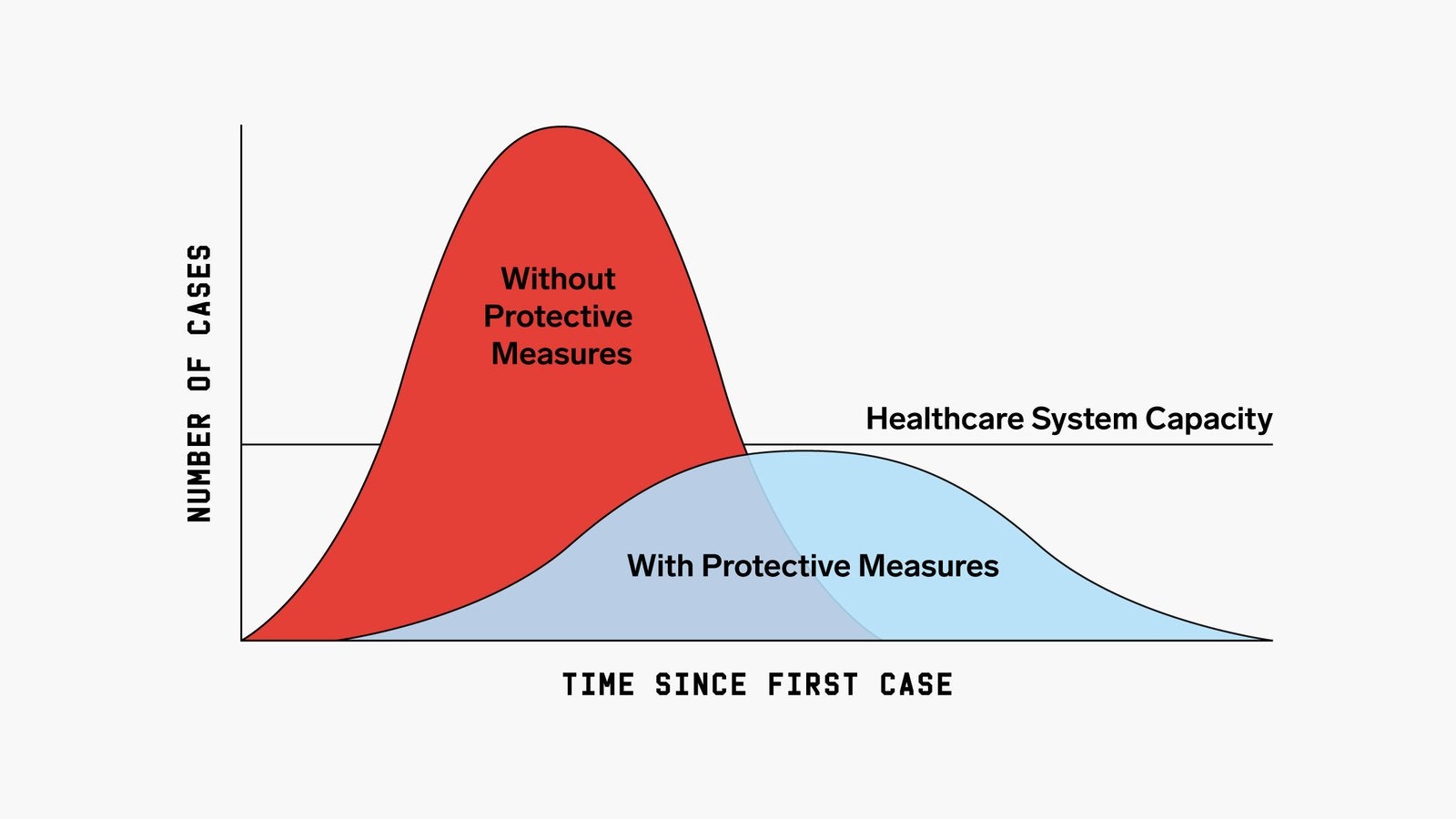
With the recent spread of COVID-19, I decided to take a look at infectious disease models and how these models generate the “Flattening the Curve” plot.
The simplest model of infectious disease spread is the SIR model. In this model, there are three groups: Susceptible (\(S\)), Infected (\(I\)), and Recovered (\(R\)). The susceptible spread the disease to the infected and the infected eventually recover. The model is governed by three differential equations:
\[\begin{align*} \frac{dS}{dt} &= -\beta S I \\ \frac{dI}{dt} &= \beta S I - \gamma I \\ \frac{dR}{dt} &= \gamma I \end{align*}\]
The idea is that the susceptible become infected at a rate proportional to the number of infected people and a parameter \(\beta\) and the infected heal at a rate \(\gamma\). So there are two big ways to reduce the number of infected people, we can either reduce \(\beta\) or increase \(\gamma\).
I’m going to start with some example code for solving the SIR model in R from here and make a gif of the effect of changing \(\beta\). In this plot I actually vary a parameter called the reproductive rate, or \(R_0\), which is equal to \(\beta / \gamma\). This can roughly be interpreted as the number of people that each infected person infects in the early stages of the disease spread (until herd immunity starts taking effect).
library(deSolve)
library(data.table)
library(ggplot2)
library(gganimate)

sir_ode <- function(times, init, parms) {
    with(as.list(c(parms, init)), {
        dS <- -beta * S * I
        dI <- beta * S * I - gamma * I
        dR <- gamma * I
        list(c(dS, dI, dR))
    })
}

simulate_sir <- function(beta) {
    infectious_time <- 7
    us_infected <- 2e4
    us_population <- 3e11
    fraction_infected <- us_infected / us_population
    parms <- c(beta = beta/infectious_time, gamma = 1/infectious_time)
    init <- c(S = 1-fraction_infected, I = fraction_infected, R = 0)
    times <- seq(0, 365, length.out = 2001)
    sir_out <- lsoda(init, times, sir_ode, parms)

    as.data.frame(sir_out)
}

betas <- seq(1, 3, by = 0.02)
beta <- as.list(betas)
names(beta) <- beta
sir_df_list <- lapply(beta, simulate_sir)
sir_df <- rbindlist(sir_df_list, idcol = 'beta')

names(sir_df) <- c('beta', 'time', 'Susceptible', 'Infected', 'Recovered')

sir_df <- melt(
    sir_df,
    id.vars = c('beta', 'time'),
    measure.vars = c('Susceptible', 'Infected', 'Recovered')
)

ggplot(sir_df, aes(x = time, y = value, color = variable)) +
    geom_line(lwd = 1.5) +
    theme_minimal() +
    theme(text = element_text(size = 15)) +
    labs(
        x = 'Days',
        y = 'Fraction in group',
        color = 'Group',
        title = 'Reproductive ratio: {current_frame}'
    ) +
    transition_manual(
        factor(beta, levels = rev(betas))
    )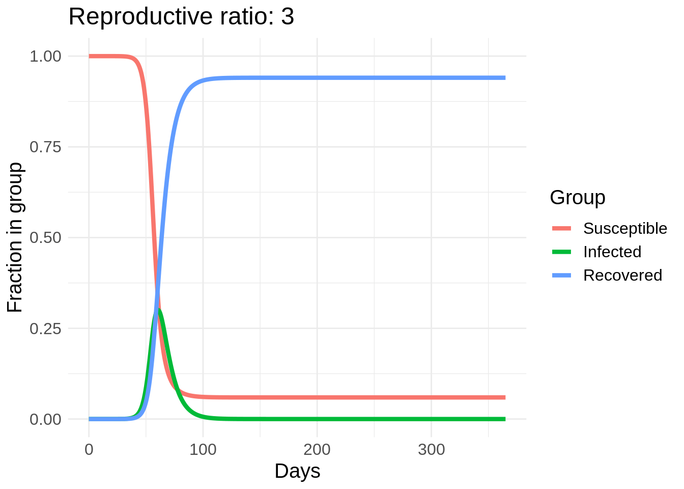
So we can see a strong effect from changing behavior, especially in the peak number of people infected. The easiest way to reduce \(R_0\) is through washing hands, disinfecting surfaces, and “social distancing” measures such as avoid large crowds and staying at least six feet away from other people. Another cool thing about this model is we can estimate the number of people who will eventually get COVID-19 if this model’s dynamics hold.
To do this we solve for \[0 = \frac{dR}{dt} = \gamma (\beta S I - \gamma I) = \gamma (\beta S - \gamma) I\]
So the number of infected hits a steady state when \[S = \frac{\gamma}{\beta} = \frac{1}{R_0}\]
Then the number of recovered is \[ R = 1 - \frac{1}{R_0}\]
So not only does lowering \(R_0\) “flatten the curve” but it also increases the percent of people who completely avoid the disease.
)